Tricky bonuses in online casinos
UX/UI DESIGN
HERO GAMING
2022
Hero Gaming is a mid-sized online casino operator with products in several markets. This project was a collaborative effort between me and Bogdan Giubernea on the product design team at Hero Gaming.
For online casinos, bonus offers are the primary method of acquiring and retaining players. Acquisition marketing is mostly done through affiliate websites with high search engine rankings that list casino offers and provide further links for users. Typically the user finds an affiliate site, clicks through to a landing page with a bonus offer and clicks a button linking to the casino registration flow. After signing up, the user is expected to make a deposit.
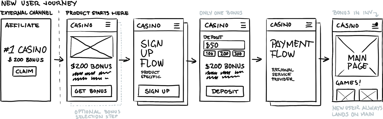
A typical journey for new users starts with a search result linking to an affiliate website. The affiliate links to a landing page showing a bonus offer and a call to action to sign up. Hero Gaming used third-party solutions for landing pages, adding an extra step for the user to get to the product, and missing opportunities to increase SEO rankings for search engines.
Data from conversion funnels showed significant drop-offs on landing pages and on the deposit screen of the casino products. The numbers varied depending on market, with users being more persistent in Japan than for instance in India, but the problem was present in all markets. Hence, the initial suggestion was to improve the design of the landing pages and improve the UI of the deposit screen to reduce drop-offs.
Discovering the problems
Analyzing the user journey, it became clear that signing up for bonus offers was anything but straightforward. Data showed users moving back and forth between screens trying to figure out if they were on the right track for their bonus.
Because each stage of the conversion funnel was managed by a different department, the content for affiliate sites, landing pages, and casinos was often sourced from different sources. This resulted in inconsistencies in both text and imagery throughout the user journey. Moreover, there was no visual indication of a bonus offer at the sign-up stage, causing users to hesitate.
Additionally, the UX and UI for the bonuses were designed differently for each market, resulting in high complexity, resource-heavy maintenance, and redundant work for the business.
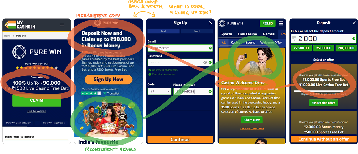
Images show inconsistency in copy and visuals throughout a user journey from the Indian casino Pure Win. Note the lack of any indication of a bonus offer at the sign-up stage.
Weird states and information overload
On the deposit screen, recordings and heat maps clearly showed user confusion. Multiple bonuses were presented in conjunction with the deposit amount field – forcing users to make multiple decisions, read extensive text, and calculate numbers – taking focus away from depositing money. Furthermore, the selection mechanics of the offers had several confusing states, and numerous buttons were displayed on the screen simultaneously. This caused information overload, resulting in users either leaving the site or skipping the deposit step completely.

The deposit screen forces users to make multiple decisions in one step, creating cognitive overload and diverting attention from depositing. Additionally, the bonus card states are confusing and do not follow common practice.
As we gathered information about the bonus process internally, it became apparent that none of the stakeholders fully grasped how bonuses worked. When we started creating a flowchart for the process, we discovered a total of nine unique flows for what appeared to be very similar applications.
In summary, one could argue that a better-designed landing page could increase clicks on the page, but the disconnect would still occur in the following steps. The inconsistency would persist, and redundant work would still be done.
Redefining the goals
In order to create a coherent user journey with consistent content, the flows had to be redefined from the first touch-point (affiliate site, display ad, email, etc.) to the point when the user initiates a deposit.
By replacing the nine flows with one single flow, we could reduce maintenance and market adaptation costs from a development standpoint.
By standardizing the UI design of bonuses, we could eliminate redundant work for the content and CRM departments.
By moving external landing pages to the casino product, we would eliminate the need for a third-party tool, further reducing workload and lowering costs.
Ideation and iteration
In collaboration with the analytics-, CRM-, marketing-, and developer teams, we designed a single flow to replace the nine existing flows. Our new flow handles all bonus types and works for all markets and products. Furthermore, it uses a landing page on the casino website rather than an external third-party solution. This not only allows users to browse the casino before signing up, it also increases brand credibility and shortens loading times, especially in markets where online scams are common and internet stability is low.
The redesigned flow replaced nine unique flows. For new users, engagement is increased by gradually presenting information to the user and introducing bonus selection prior to signing up and depositing. For returning users, the journey is shorter and more consistent, independent of the type of bonus they opt in for.
Establishing the idea
Gathering information about bonuses was challenging. Discussions of changes to bonuses were particularly sensitive internally, as they are the main way of acquiring new users. Our competitor research didn’t reveal any clear patterns either – confusing flows with cryptic copy seemed to be the industry standard.
To establish our idea for a new bonus flow, we initially presented low-fidelity wireframes to small groups of stakeholders. We focused on improvements in areas relevant to each stakeholder rather than overarching changes to flows and work routines. This approach slowly created buy-in and enthusiasm for change from each stakeholder, opening up discussions and information gathering.
Low-fidelity wireframes were used to verify the proposed flow from a business and technical perspective, and to establish the concept within the organization.
Based on the discussions and feedback, we created a wireframe prototype that was presented to larger groups and a wider audience of stakeholders, including developers. Through this method, we created a larger scale of involvement and investment from all parties. This fostered a positive attitude towards improvements rather than resistance to change.
Standardized UI component
Because the same flow would be used for all markets, a standardized UI component for bonuses was developed. Its adaptable design handles several content types, languages, controls, indicators, and states allowing the same component to be used across all products. It is responsive, handles most screen sizes, and can easily be themed and integrated into different product designs.

The card component is based on an adaptable, size-agnostic template that can easily be themed and integrated into all of the company’s products. The design takes various screen sizes as well as touch screens and traditional screens into account.
Testing the prototype
Using the new flow and card component, we created a high-fidelity prototype that was tested on 15 users through observational testing. Due to budget and geographical constraints, we were limited to testing internally with our colleagues. Focusing on non-expert users, testing still provided valuable feedback, primarily on UI details and messaging. You can find the Figma prototype here (new window).
The main finding from testing the prototype was that users tended to remember the high monetary value mentioned in the bonus headline more than anything else. The first iterations of the deposit screen only displayed bullet points with rewards, omitting the headline. This had to be updated.
Furthermore, users found the redesigned flow and the new card component so intuitive that they didn’t realise it differed from the actual product. Several users had to be shown the live product to be convinced, and were shocked by its current state.
The updated design
Because the external landing pages have been removed, the user experiences consistency in both imagery and messaging from the first landing page all the way through to finalizing their first deposit.
The updated design displays elements from the selected bonus at every step of the flow. The amount of elements varies depending on the context. For instance, the bonus page shows detailed information while the sign up stage only shows a ribbon with the bonus label to let the user focus on creating an account. On the deposit screen, the headline has been placed below the bullet point rewards. This allows variable rewards, which update based on deposit amount, to be more visible.

Closing thoughts
Sometimes, projects that seem to consist of a few quick fixes can become complex problems once you scratch the surface. There is always a price/performance discussion to be had, and sometimes it’s better to aim for smaller quick wins. In this case, we saw potential for long-term big wins.
To streamline the bonus process and make better use of internal resources, we needed to redesign the whole user journey. We replaced several user flows with a single flow designed to work with all products and markets. And that, in turn resulted in us needing to design an additional UI component to ensure information consistency.
One of the biggest challenges in this project was information gathering and people’s natural resistance to change. Each department perceived that their current bonus solution worked, and for each department individually it probably did, at least well enough. But looking at the data, and the bigger picture, there obviously were many improvements to be made.
Unfortunately I never got to see actual data on how this change would affect conversion, as I left the company before the project development was finalized.