Rebranding regional to national
BRANDING, ART DIRECTION
FREELANCE
2019
Concept development, art direction and project management: Tomas Dettlaff. Copywriting: Anna Drake. Animation: Depiction. Photo & video: Apelöga.
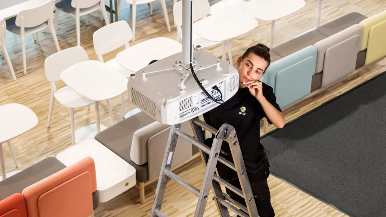
AVS is one of Sweden’s largest providers of audio/video equipment for public organizations and institutions. Founded in the south of Sweden as AV Syd in 1986, the company has grown and expanded from being a regional company to become a nationwide business, hence rebranding from AV Syd (Syd means South in Swedish) to AVS.

Even though this was a complete rebranding, it was imperative to retain a connection to the old brand to minimize loss of brand equity and not to create confusion within the customer base. The industry that AVS operates in is generic, with most competitors offering largely the same services and expertise. Its customers’ purchasing decisions are largely based on habit, price and perceived quality of service. The latter being based partly on individual experiences and partly on what others say, and here communication can make a difference.
Visual identity
The objective was to create a contemporary, differentiating identity that conveyed the concept of digital media (in contrast to the previous analog connection). To capitalize on existing brand equity, the primary orange color is carried over from AVS’ previous identity, with a supplementary turquoise color added. While orange was commonly used in the AV industry, the use of turquoise was unique. As a mix of blue and green, this color is associated with technology and ecology.
Like the previous identity, the updated one is based on the letters A and V. The simplified forms of the signs become triangles, which form the basis of the identity. For the brand symbol, the triangles form a cube in orthographic perspective. This places the symbol in the realm between two and three dimensions, referencing 3D graphics, virtual worlds and thus creating the connection to digital media. The cube symbolizes a room, or space, in which another cube is placed; a space within space as an audio-visual experience that takes the user to a different mental space; or a package with equipment; or the core of something. The abstract nature of the symbol leaves the viewer free to interpret it. This in turn can create a rewarding feeling of accomplishment once viewers feel they have cracked the visual riddle.
Logo
The AVS symbol has the contour of a hexagon, a shape that was unique in the industry at the time of creation. The simple shape allows for easy identification and recognition. The logotype is set in bespoke handwriting, further adding to the humanist aspect, while also associating with the use of touch screens. It is designed to maintain legibility in small sizes and from a distance. What it loses in aesthetics, it gains in brand recognition.


Symbol animation
Short animations were developed for the symbol to be used in video, and as bespoke start-up visuals for projectors and screens. The animations are also used as an intro or outro for video material as shown in the top image of this page.

Visual element
The visual element is constructed from a repetition of the symbol in varying sizes and overlaps, aligned in a triangle grid. Because of the design of the symbol, it is possible to create elements with depth and dynamism. The element is primarily intended for use in two-dimensional media, such as screen or print.

Pattern
The AVS pattern is based on the symbol and is created as a report which, like wallpaper, allows the pattern to be repeated vertically and horizontally. As the pattern is full coverage and has a flat appearance, it is primarily designed to be used on three-dimensional artifacts (such as cars, packaging, etc.).

Typography
The brand typeface is Avenir Next designed by Adrian Frutiger and Akria Kobayashi. It works well in both analog and digital media, has high legibility and a modern humanistic expression. The weights primarily used are Avenir Next Regular and Avenir Next Demi.

Imagery and video
The style is clean, crisp and sharp, displaying real-world situations with actual employees, users or clients when possible. Visuals show people of different genders, ethnicities, and ages. Ideally a relevant product or service should be included. Closeups are to be avoided.


Physical space
Examples of how the visual identity can be used in physical space. First rendering shows a expo stand with interactive screens, a video wall and a laser projector. Second rendering shows a mobile pop-up stand for smaller events.

